


Conversion optimization tactics for ecommerce
16 Sep, 2021 / 9 MIN read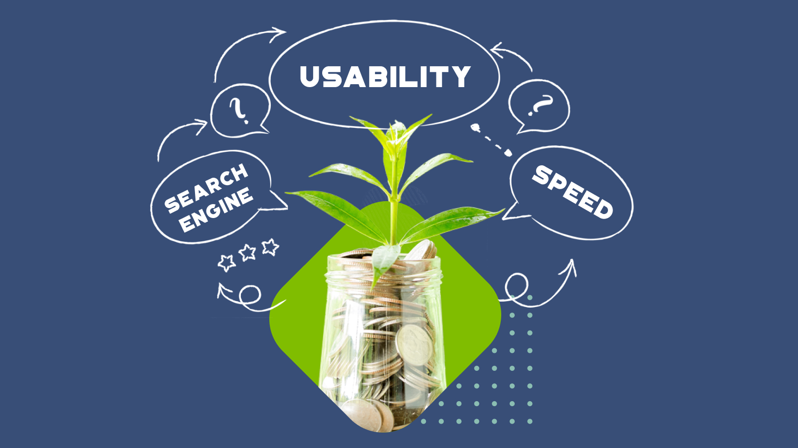
Conversion rates are one of the most important metrics for an online store. You may invest a lot of money into product quality, operational excellence, and have all the traffic in the world. But what is the point if only a few customers buy from it?
Just make simple calculations with increased conversion by 1-2-3-4-5% and look at the numbers, you will be more than convinced that investing into conversion optimization is worth it.
Below, we have covered several ideas and tactics on how you may improve your conversion rates and bottom line profits correspondingly.
UX design & ecommerce store performance as key factors for higher conversions
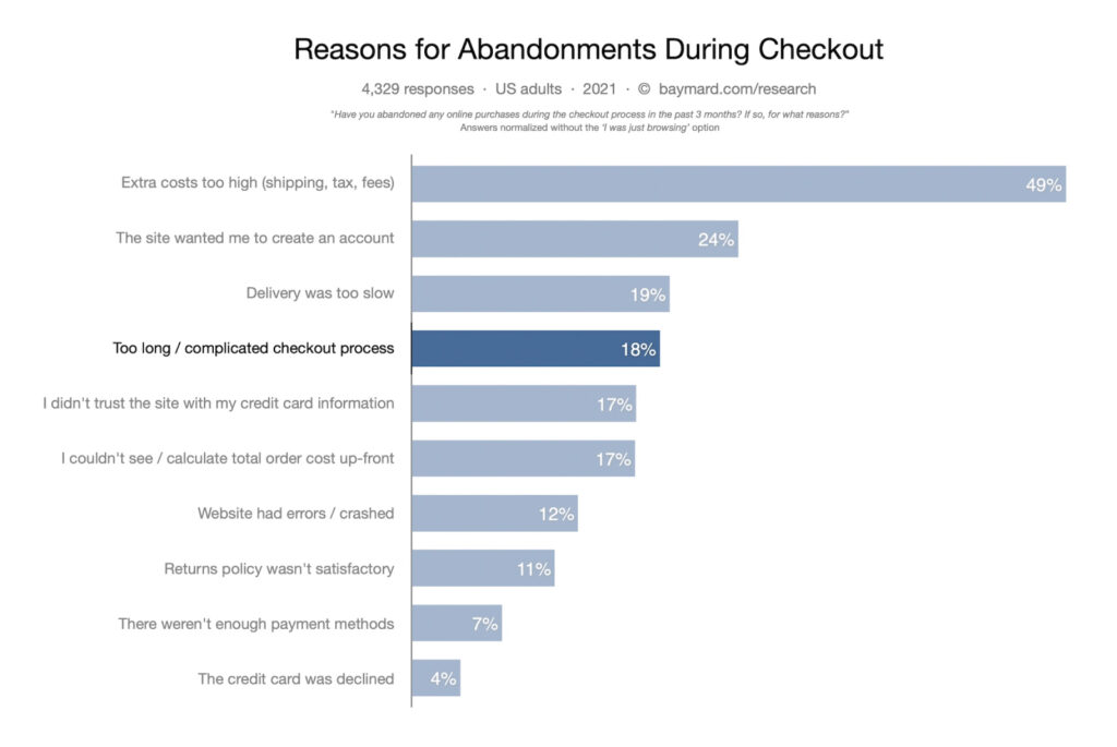
A major factor that increases conversion rates in eCommerce is design. And, this isn’t just limited to the beautiful images, elements & effects within an eCommerce space. You could have all of those wow elements but still only see low conversion rates.
If your store is poorly designed in terms of usability, it will in many cases imply a reduction in conversion and an increase in cart abandonment.
Such factors as product search issues, disorganization, and misinformation may have a really negative impact on the number of purchases made. As well as not optimally planned navigation and complex forms with a great number of fields create impatience and frustration which results in abandonment.
Same applies to performance of the site – slow loading time, poor mobile optimization, and inefficient search functionality. All of these things are killing your conversions!
Detecting conversion killers and finding solutions to fight them should be your primary goal towards significant improvement of business results.
Here are some fundamental points to take into account:
Site search
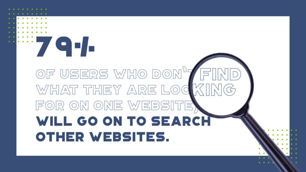
A fundamental law of an eCommerce store is you cannot sell a product that your customers cannot find.
Search is a basic function in eCommerce and must offer a fast and reliable experience, especially in a mobile-optimized version. Populating these results accurately and quickly allows a customer to easily find exactly what they need to make a purchase. Facilitating that search effortlessly with the help of filterable search and ranking criteria offers a simple experience adapted to the buyer’s expectations.
79% of users who don’t find what they are looking for on one website, will go on to search other websites. The average attention span is 10 seconds.
Site Navigation
Much of the abandonment of online store shopping carts is a result of frustrated users not able to quickly find the information they need using online store navigation. This could be data related to shipping costs and times, stock availability, or product features and options.
The culprit here is poor information architecture, a confusing visual hierarchy, and poor identification of clickable elements, among other factors. As a result, this generates friction when browsing your store which provokes the user to begin considering other options.
To avoid this, we must take into account certain aspects:
Visual coherence
You must be consistent with the visual styles throughout your store, and clearly differentiate the clickable elements and calls to actions. This will confidently guide the user through your store, help to build trust, remove doubts, and create a smooth and memorable brand and user experience.
Follow the “Principle of least effort”, and don’t make users think unnecessarily.
Keep design predictable
There’s no need to reinvent the wheel, we as humans in most cases are still creatures of habit. A buyer will arrive at your sight with a preconceived idea of how things should work, and where they can find certain information. The way in which they experience this differs from site to site, but the core of the action should be consistent and predictable. A great example of this is the “Z pattern”, where a user typically scans for content in a Z pattern across the page, like you can see below.
The “Above The Fold” concept – the Pareto Principle
The second thing to consider is content prioritization. The “above the fold” hails back to the days of the newspaper; all the best content was always above the fold in the middle. Websites and eCommerce stores in reality are no different, the high-value content simply appears before a user scrolls anywhere else. Research from the Nielsen Norman Group shows that this “above the fold” content receives the most viewing time, as well because it helps form that first impression of the space. The next few sections of content scrolls receive about 74% of the user attention, and finally the bottom of the page receives only about 26% of user attention. Basic but very important thing when it comes to developing and placing content and layout efforts.
Accessibility & contrasting text colour
A high percentage of users may experience any range of vision impairment throughout the day, so it’s worth taking into consideration. Make sure there’s enough contrast when setting text against a colored background, or consider colorblind web page filters. There are a number of online tools to help get the job done, like contrast-ratio.com. It’s also important to use icons or notifications to reinforce a message, not relying simply on color. There are lots of materials on what is web accessibility out there, digging deeper into the topic and implementing it on your web will be beneficial for both your customers and your business.
Product Page
The product page is one of the critical points when it comes to conversion, so it must be designed with special care. The user must be able to use this space to find a clear, concise, and impactful description about the product. You must be able to clearly display all information about product characteristics, shipments, and purchase benefits to win over their hearts, and their wallets. The last thing you’d want them to experience is any kind of doubt or confusion regarding the purchase options or product configurability.
Some tips on this.
Product photos with quality
Provide super-detailed and hi-resolution quality photos of your products. Your customer has no other way to learn about your product quality, texture, and size, aside from these images. Tiny details that are discernable in store simply aren’t an option here. But with good photos you can give them such an option.
It is also necessary to include a photo with a visual size reference, to provide an idea of the proportions of the product. If you have the possibility of including video or 3d visualization, it’s an extra added point!
Make the advantages of buying in your store stand out
Many businesses overlook this option and focus more on homepage or other pages like about us, to convince customers they are the right choice.
But the product page is one of the best places to convince your customer to consider purchasing from your store. Take advantage of it and place your advantages in a visible place.
Related products
The product page is an optimal place to present the user with products that they may not have previously considered. This then creates the opportunity to present complementary purchase options, helping to increase the user’s time in your store, and being able to benefit from the increase in the average order.
Sign-up Forms and Account Creation
In relation to forms, always keep in mind the theory of “less is more”.
Forms can be long and tedious requiring too much personal information or not having the necessary input options. This can cause certain potential customers to abandon the purchase process.
Here are some pieces of advice:
Possibility of buying as a guest
This option will speed up the purchasing process, reducing the chances of friction and offering your users the creation of an account at the end of the process, once they have completed the order.
Be clear, concise and explanatory when a mistake occurred
A user cannot solve the error if they do not know what they did wrong, and this can block the process.
Be as transparent as possible if you need to collect personal data.
Users are not always willing to give up their personal data, especially when they don’t know where and how it will be used. If you need to collect sensitive personal information (aphone number for example) you must include some type of notification or tooltip that clarifies why it is necessary and how it will be used.
Don’t overwhelm users
It is not recommended to use long and complex forms. If you require the user to fill in a high number of fields, group and divide them into several blocks. This way, the user perceives it as a simpler task and easier to fill in, thus reducing their cognitive load.
If you want to learn more about improving a forms usability, here’s an interesting article of best practices when designing forms.
Mobile-optimized design
It’s 2021 yet we’re still talking about it. Lots of ecommerce stores are still experiencing issues with mobile-optimized versions of their online store pages.
Mobile transactions constitute around 35% of all transactions carried out in the world of eCommerce. Choosing not to have a mobile adaptation of your eCommerce that is fully functional and well designed is quite simply leaving money on the table.
Load time on mobile devices is especially critical, as it should not exceed 2-5 seconds.
We must take special care when designing for mobile with the size of the clickable elements. Small icons and button links can be problematic, especially when they are grouped close to each other. The minimum size of such an element that can be clicked should be around 48px.
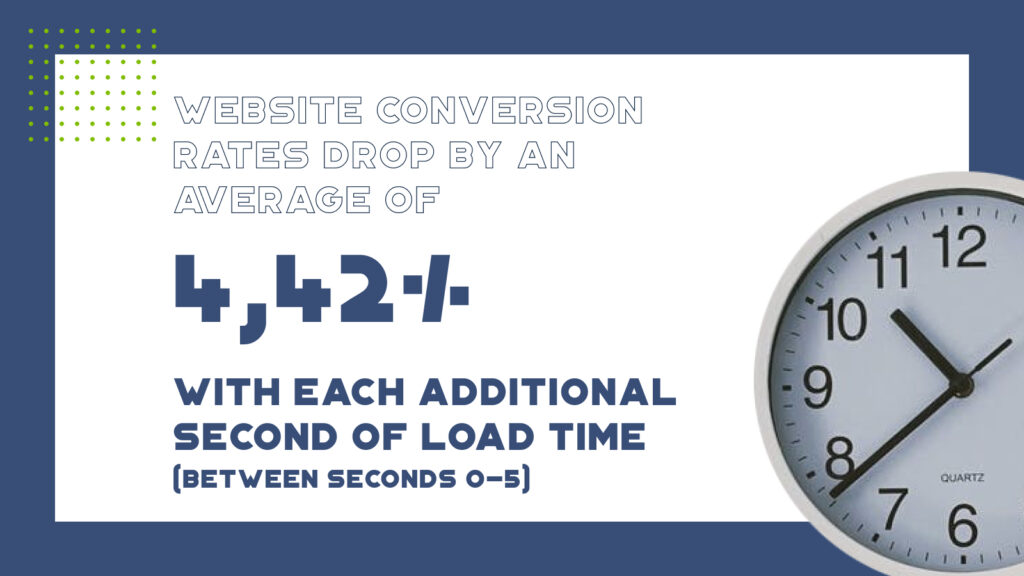
Web performance
With the speed of everything increasing by the minute we have no time to wait. Page loads of 7-10 seconds is a thing of the past, and a guaranteed way to increase your abandonment statistics.
If you’re looking to improve your conversions, make performance enhancements one of the top priorities for your business.
So, it’s time to see how your ecommerce store is doing in terms of conversion and whether there’s room for improvement. Let’s start:
Are the products easy to find using the site search on desktop and mobile?
Is information about the delivery easy to find?
Is the information about product features and characteristics available and helpful to make a purchasing decision?
Are clickable elements easily identified on the pages?
Is the design predictable and are the common elements and functions in the correct locations?
Is the most important information clearly defined within the first 3 folds?
Is design accessible for people with visual impairments?
Are product images and videos conveying information about the product – texture, materials, size, etc?
Have you included your store/business advantages on the product page?
Have you included related products to the product page?
Are your forms too long? Do they require unnecessary personal information?
Are you explaining the purpose behind collecting personal information?
Is there an option to purchase as a guest?
Are your error messages clear enough for the buyer to correct any mistakes?
Is your site loading and functional in less than 3 seconds? On mobile and desktop?
This checklist can be a good starting point for you to increase your chances of eCommerce conversions. For more ideas on how your online store conversions can be improved, reach out to our team!
// This is a JS example
var test = "Hello";
console.log(test);